Android
Brand Identity
Design System
Brand Photoshoot Art Direction
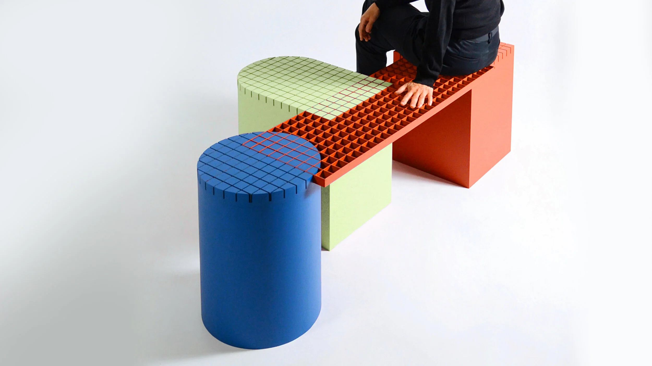
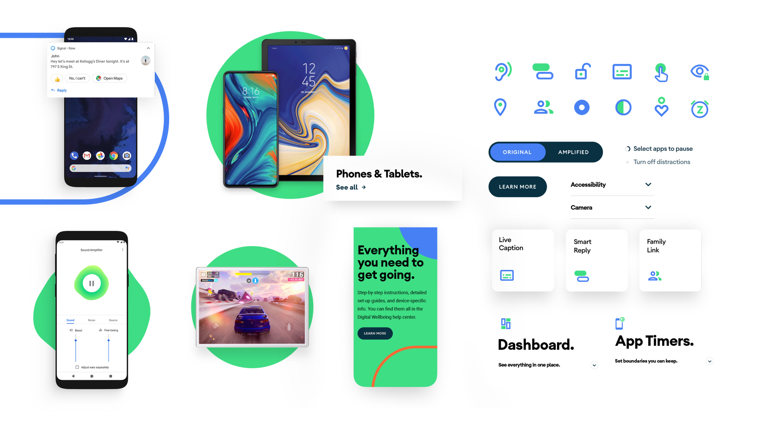
Product Design
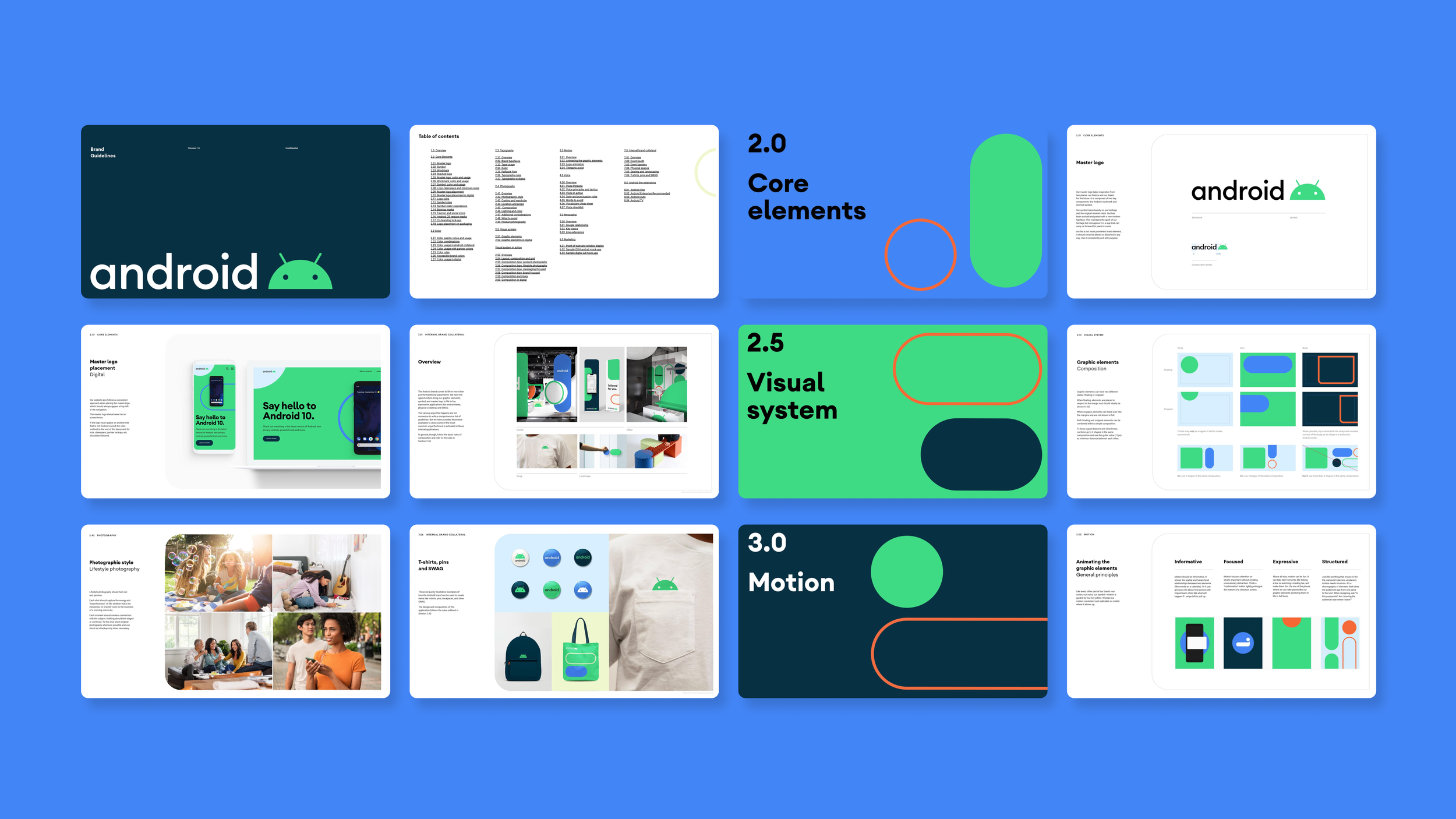
Brand Guideline
Storyboarding
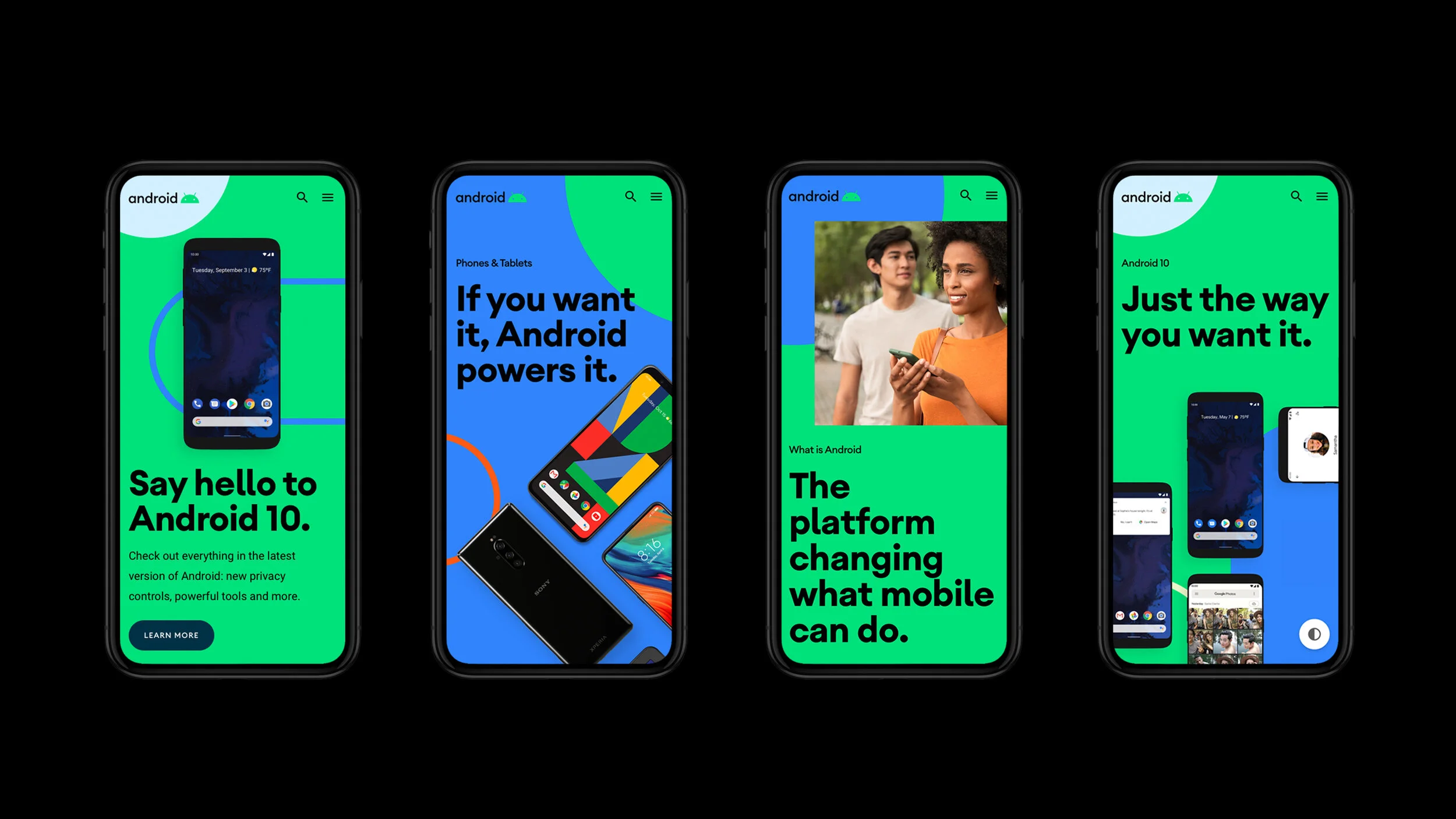
We evolved the Android brand to make it more modern, globally inclusive, and accessible. Our work spanned the entire brand experience: from brand architecture and strategy, to a robust identity system with comprehensive guidelines and partner assets, to a fully reimagined mobile-first digital experience on Android.com.
Client:
Google New York
Recognition:
One Show, Clio Awards, ADC Awards
Link:
android.com
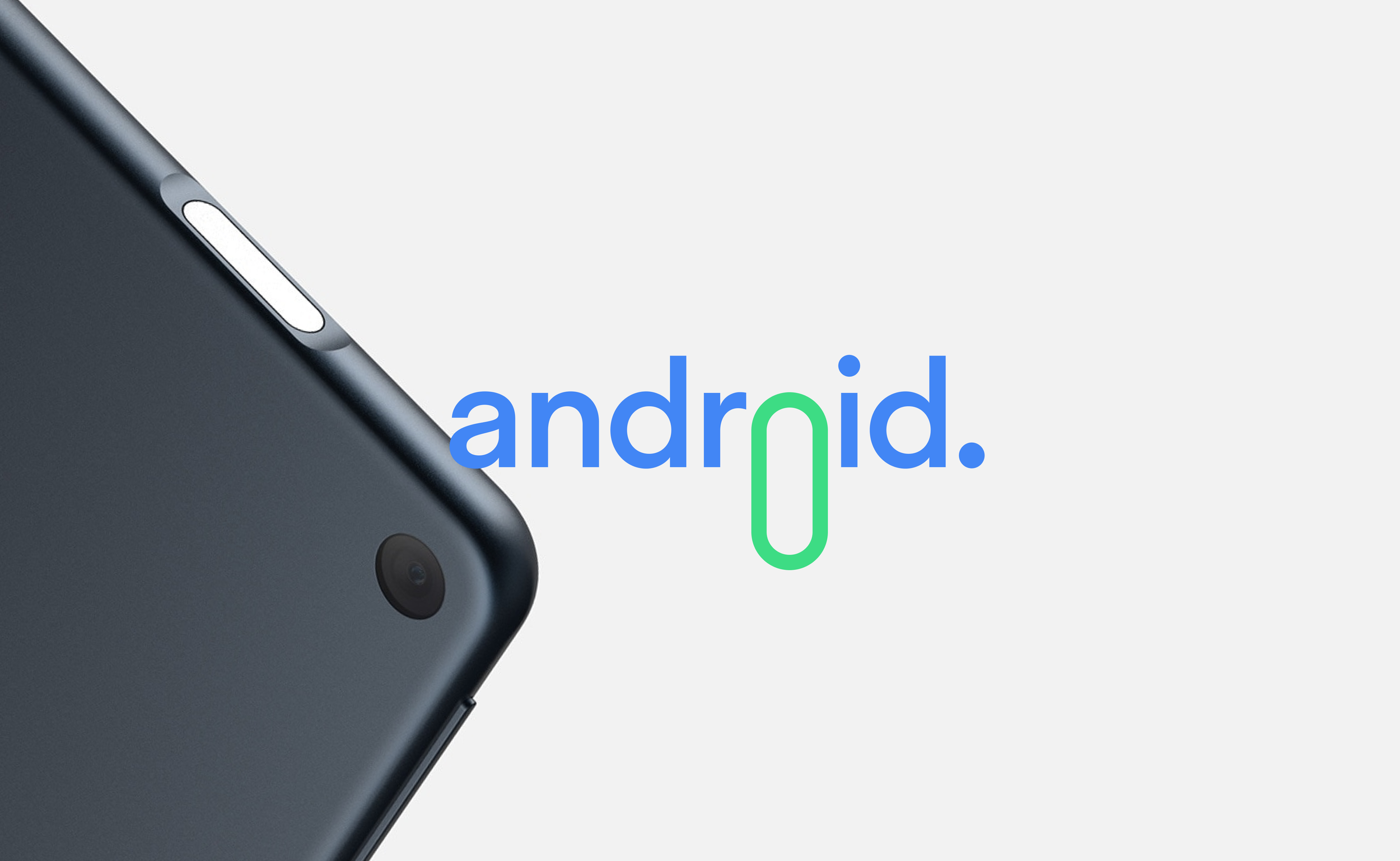
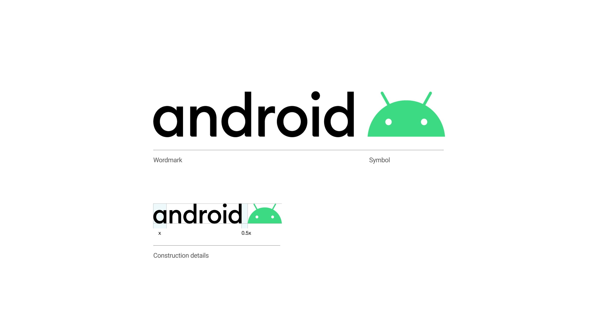
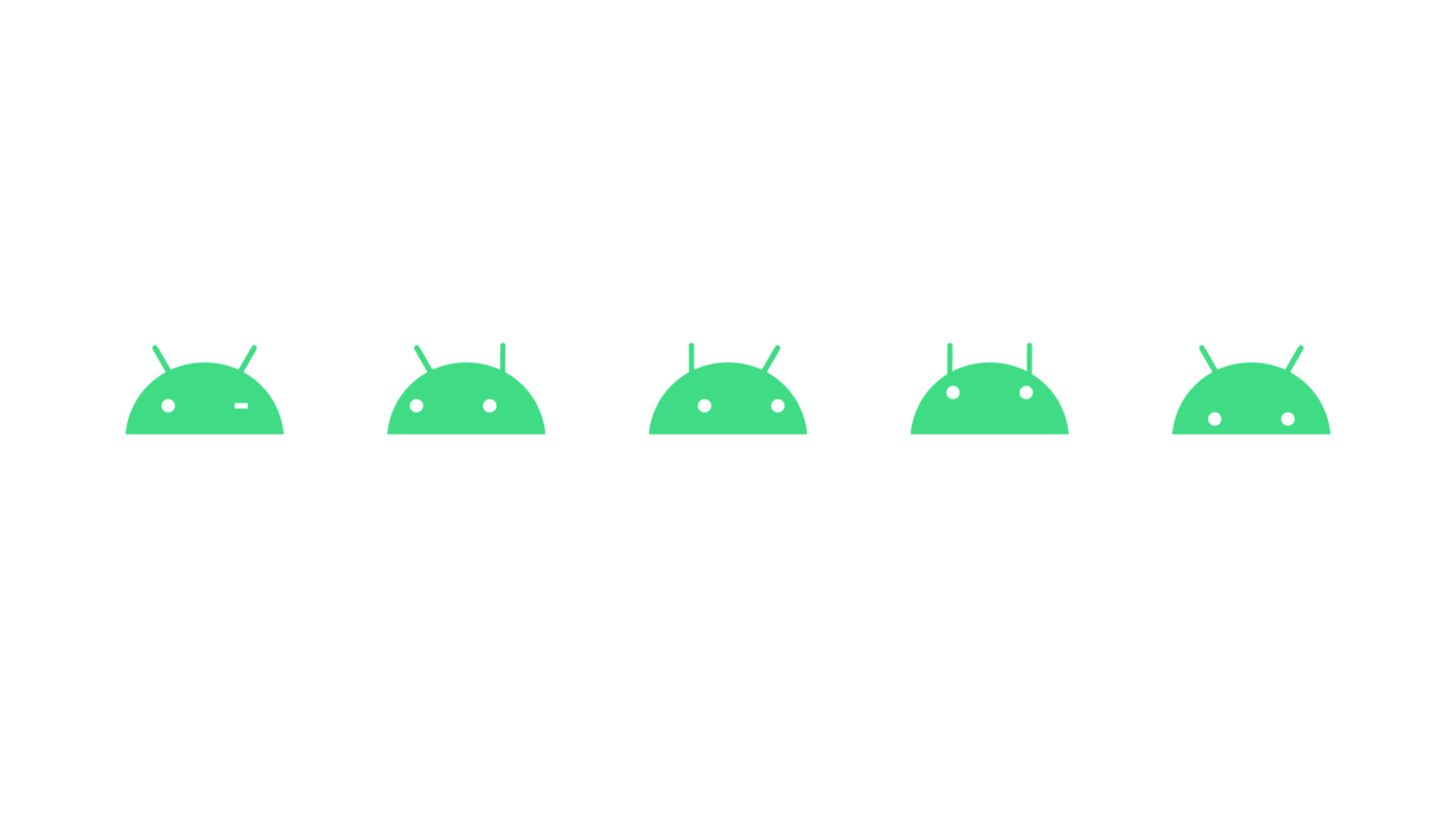
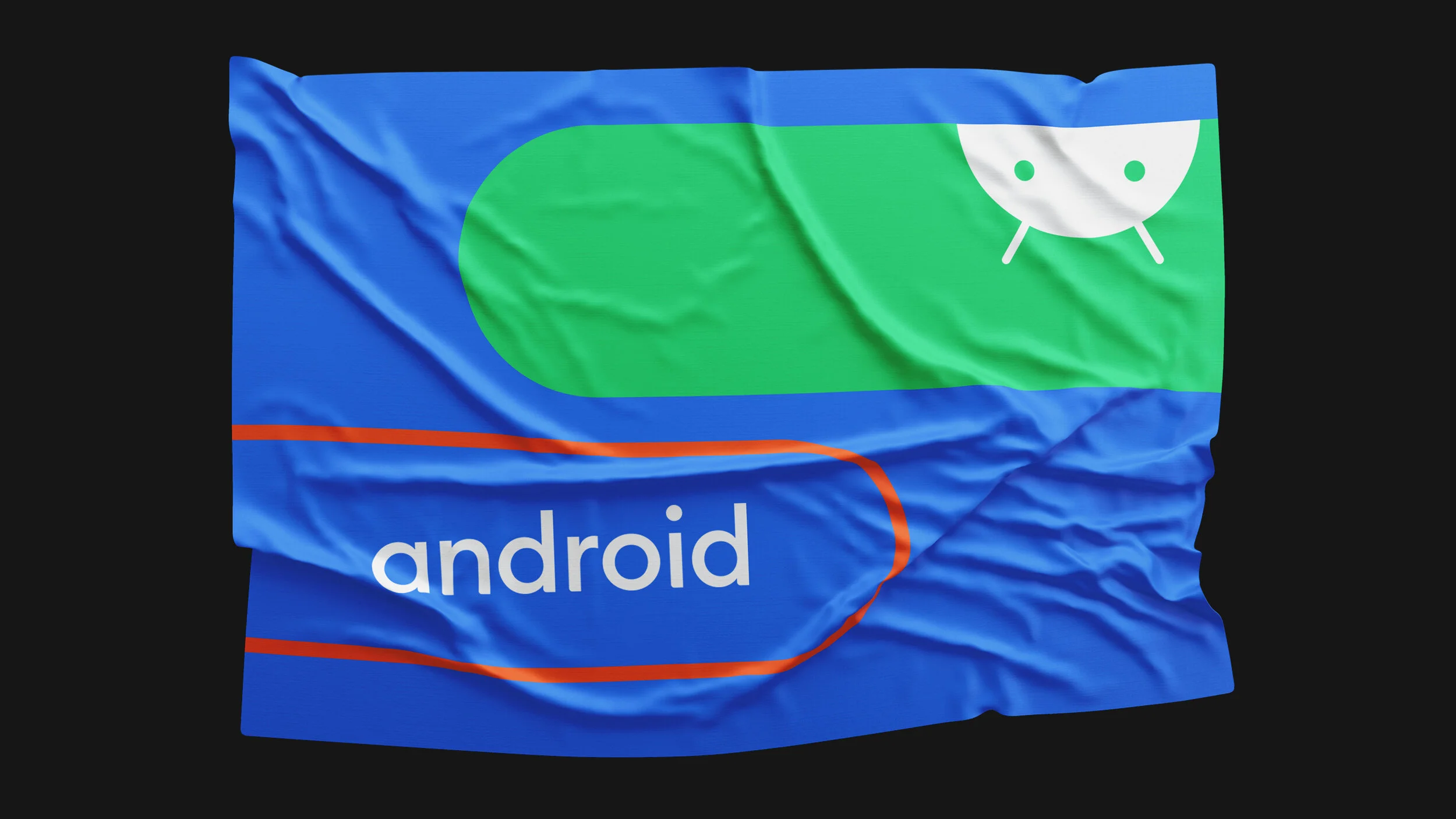
Logo and Typeface
The logo is composed of two key components: the Android wordmark and Android symbol. Android Euclid is main and proprietary typeface. It’s as recognizable a part of the brand as symbol or Android Green. It has been created with the same principles as the rest of the brand. Simple, beautiful and a hint of the previous Android type with a whole lot of modern sophistication. A new black wordmark and accessible color palette, opening up a whole new world of possibilities for a truly global brand.
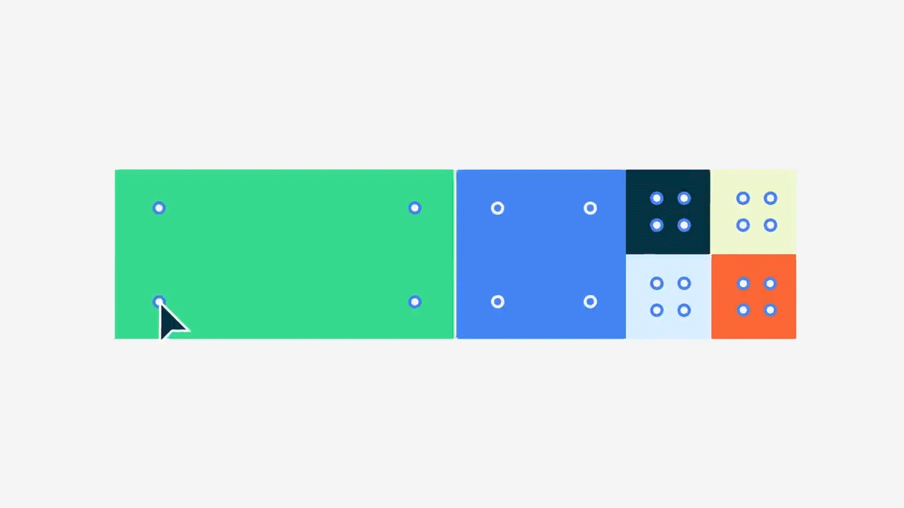
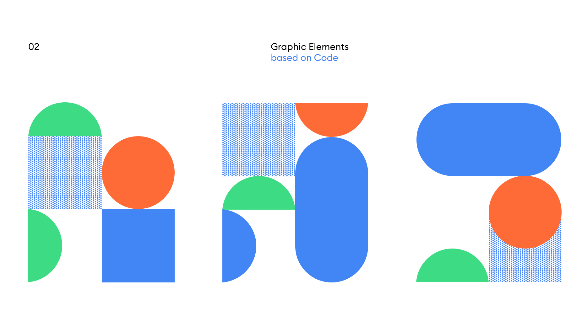
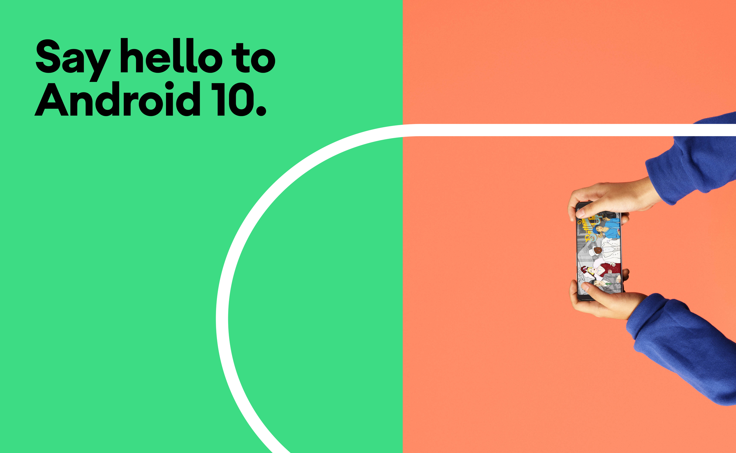
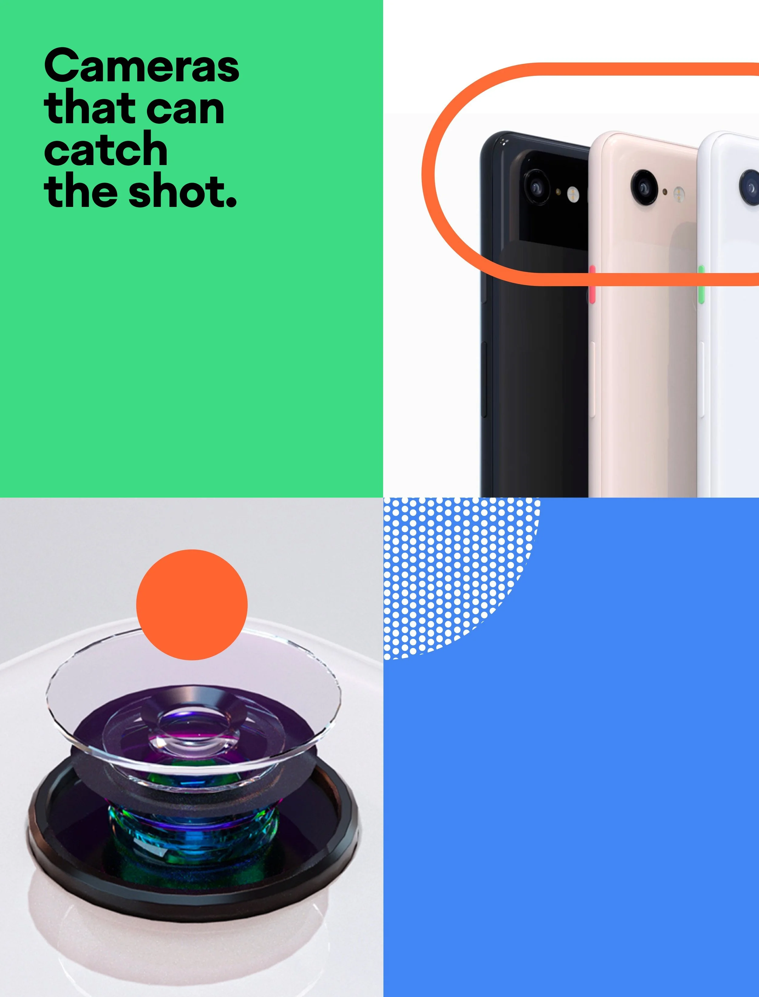
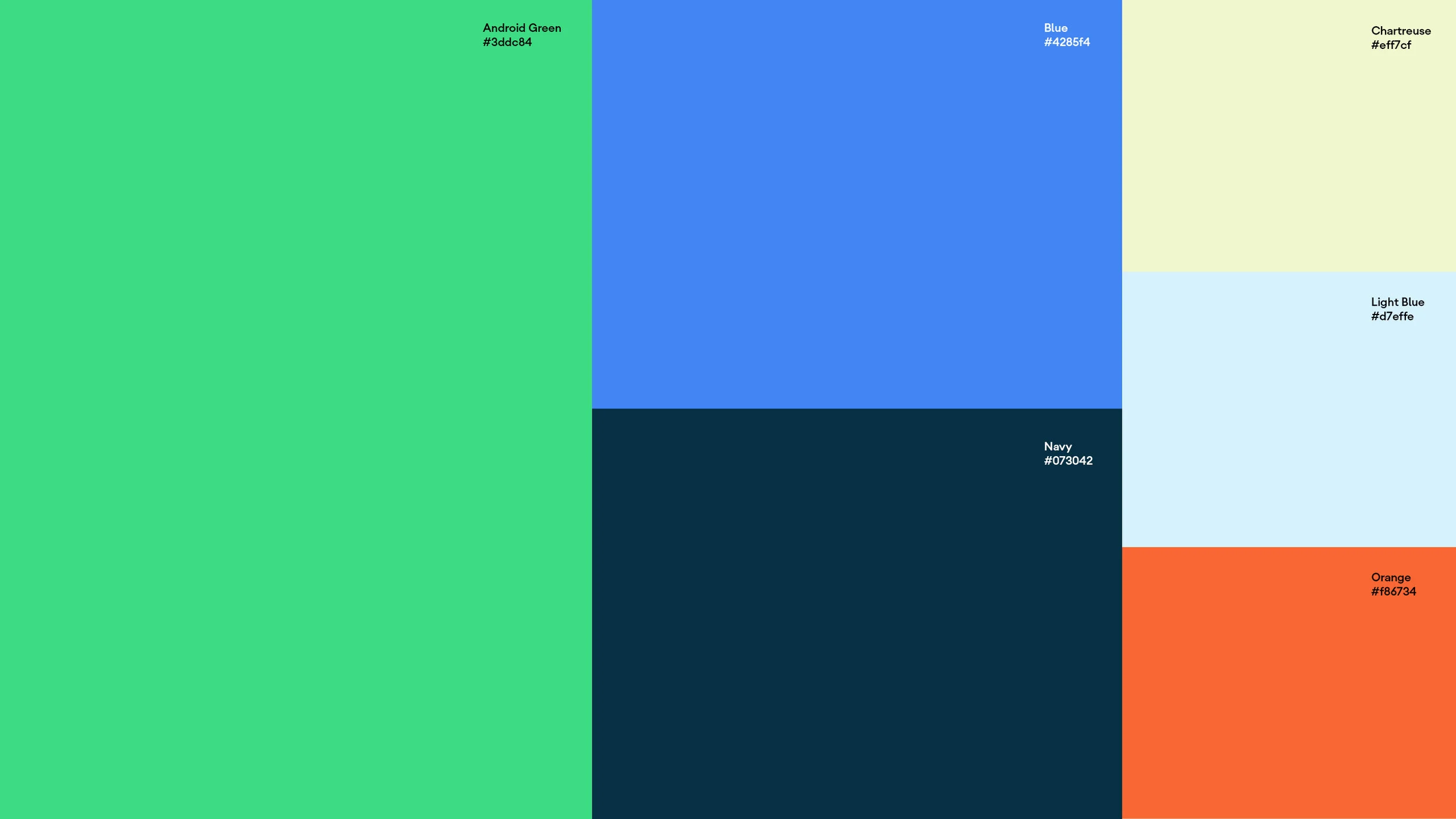
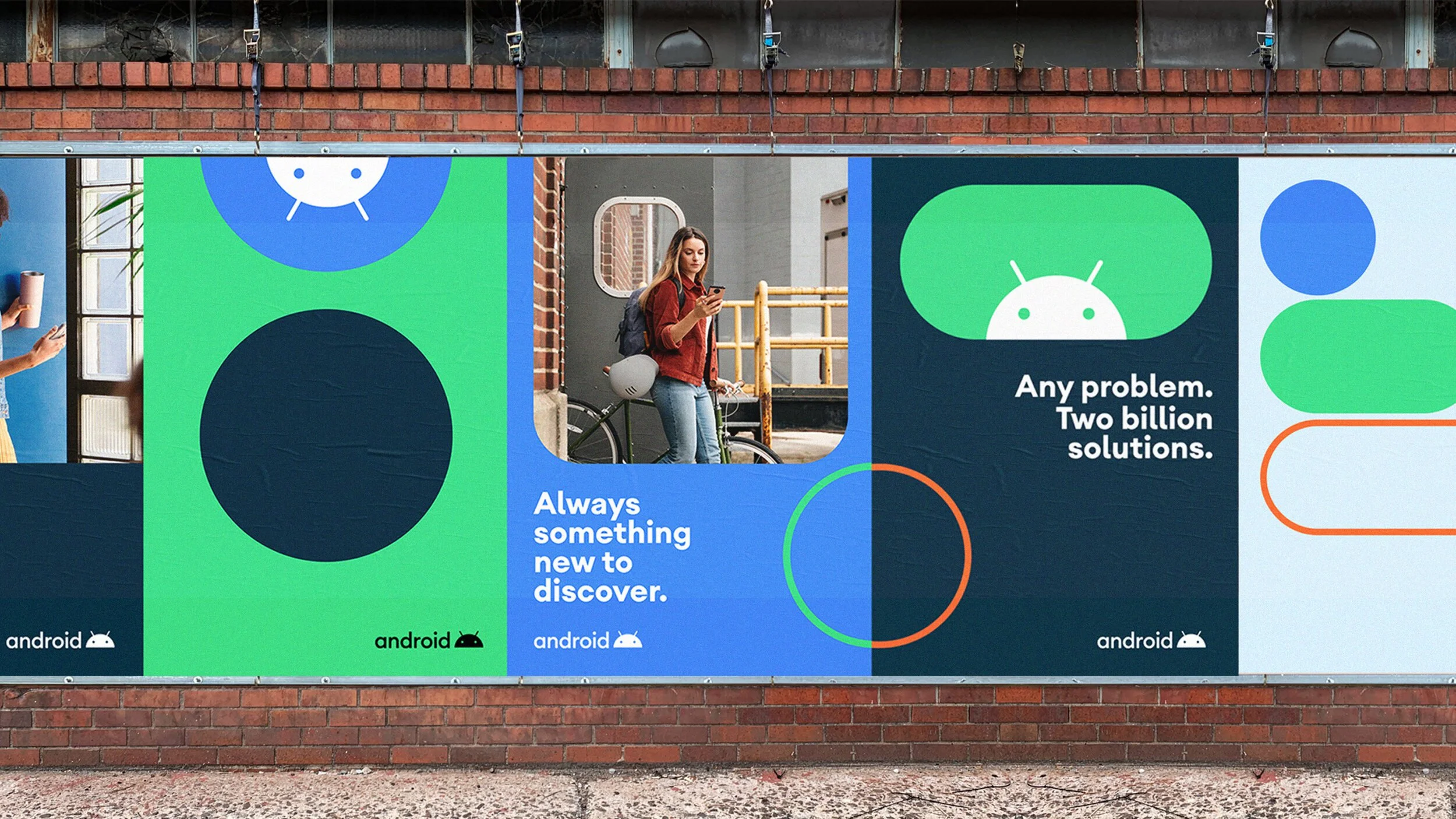
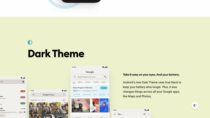
Color & Graphic Elements
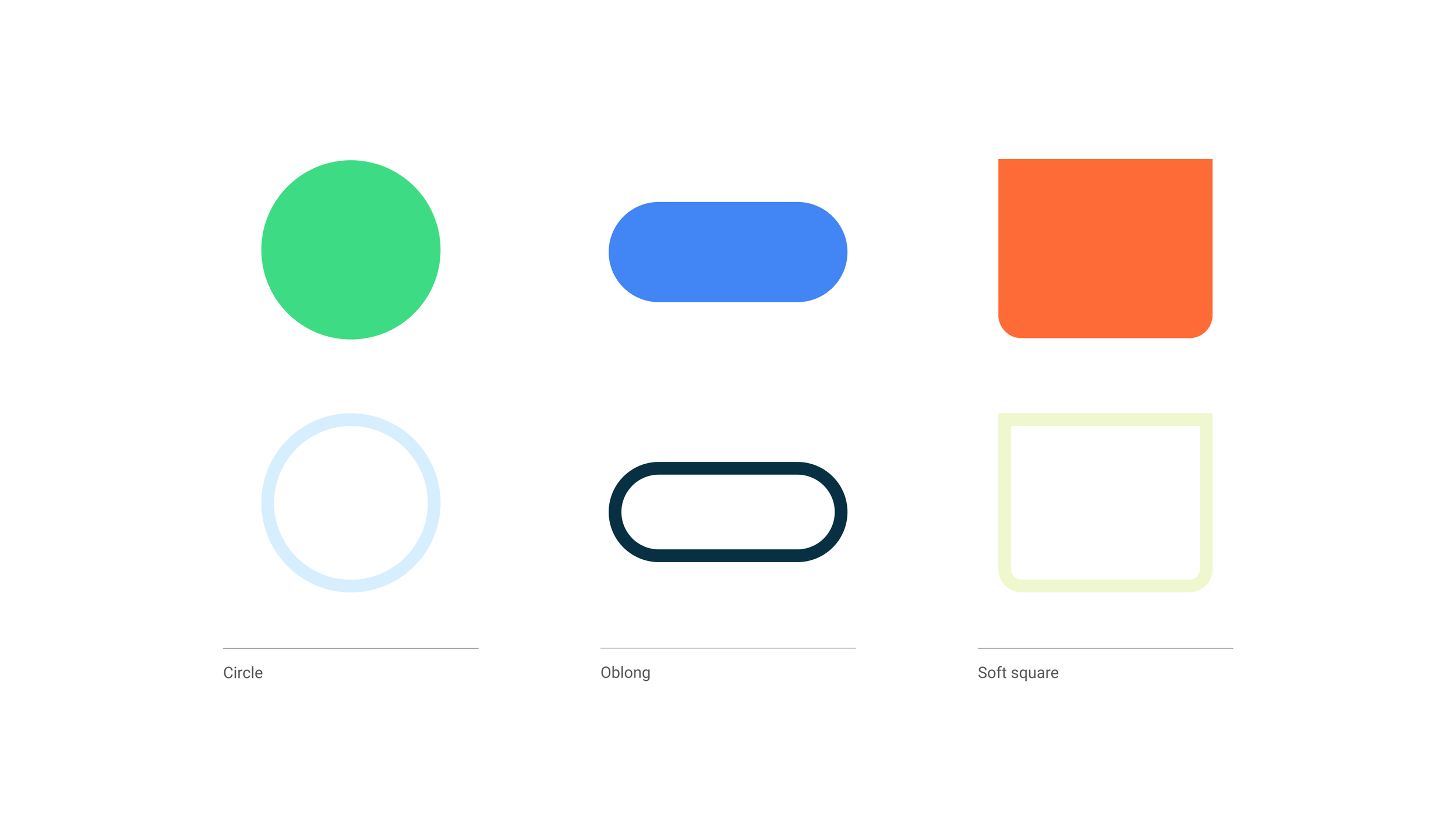
Just like our symbol and word-mark, our colors are a mix of where Android has come from and where we want to go. And the identity revolves around a set of expanding, roving button-like shapes in both stroked and filled styles that even though they are fairly basic they expand quite nicely into a full visual language that feels playful and dynamic.
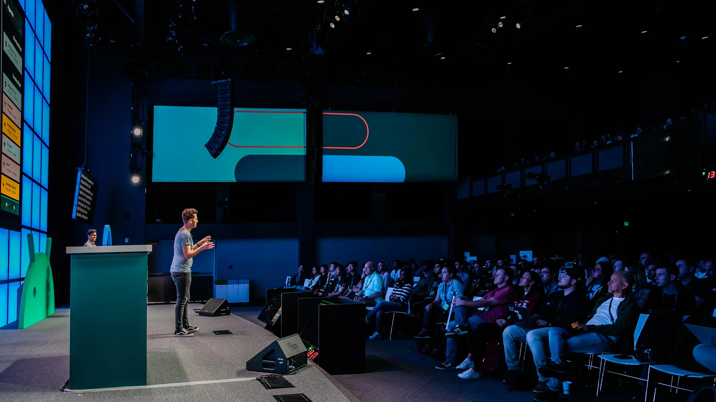


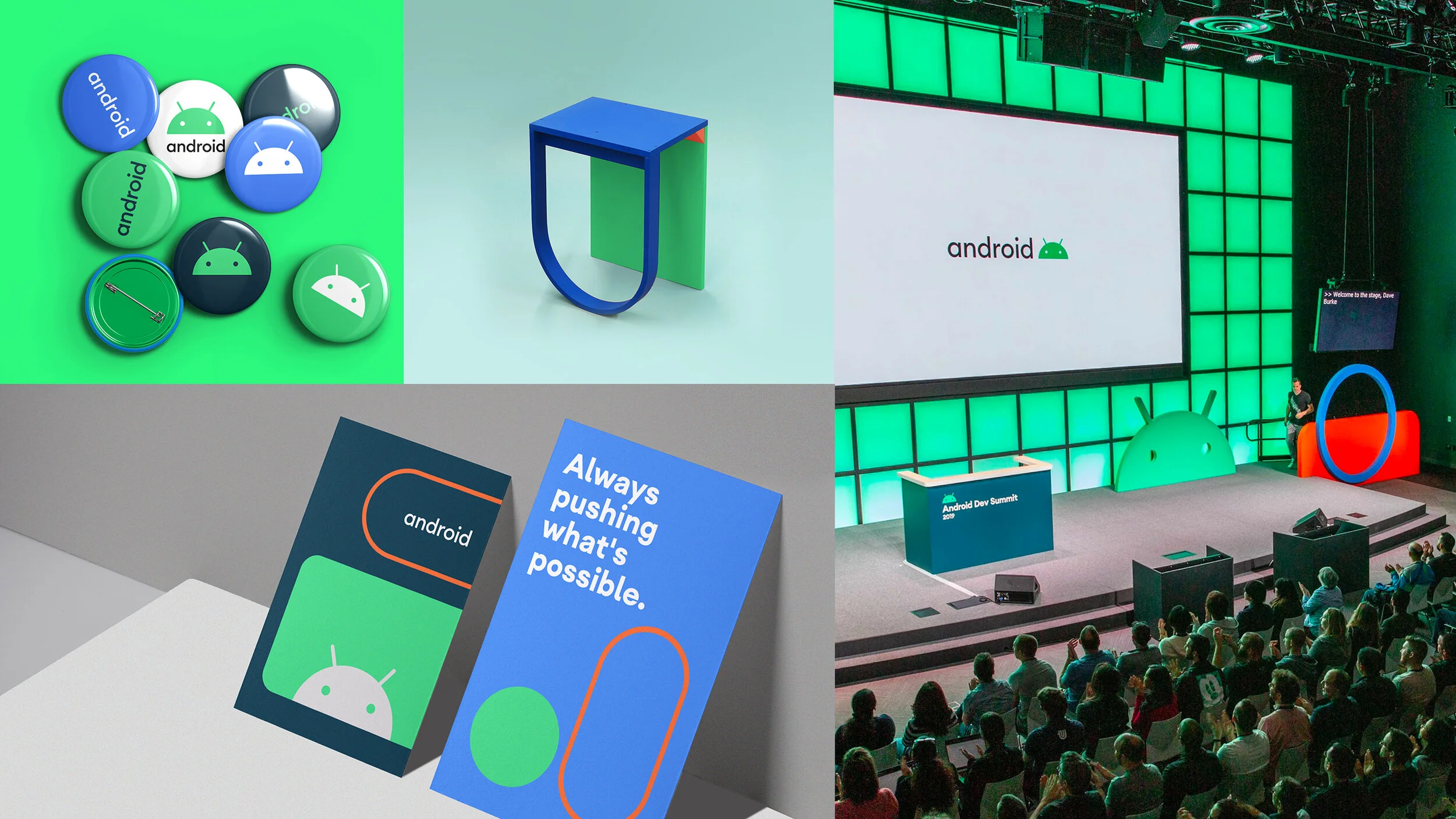

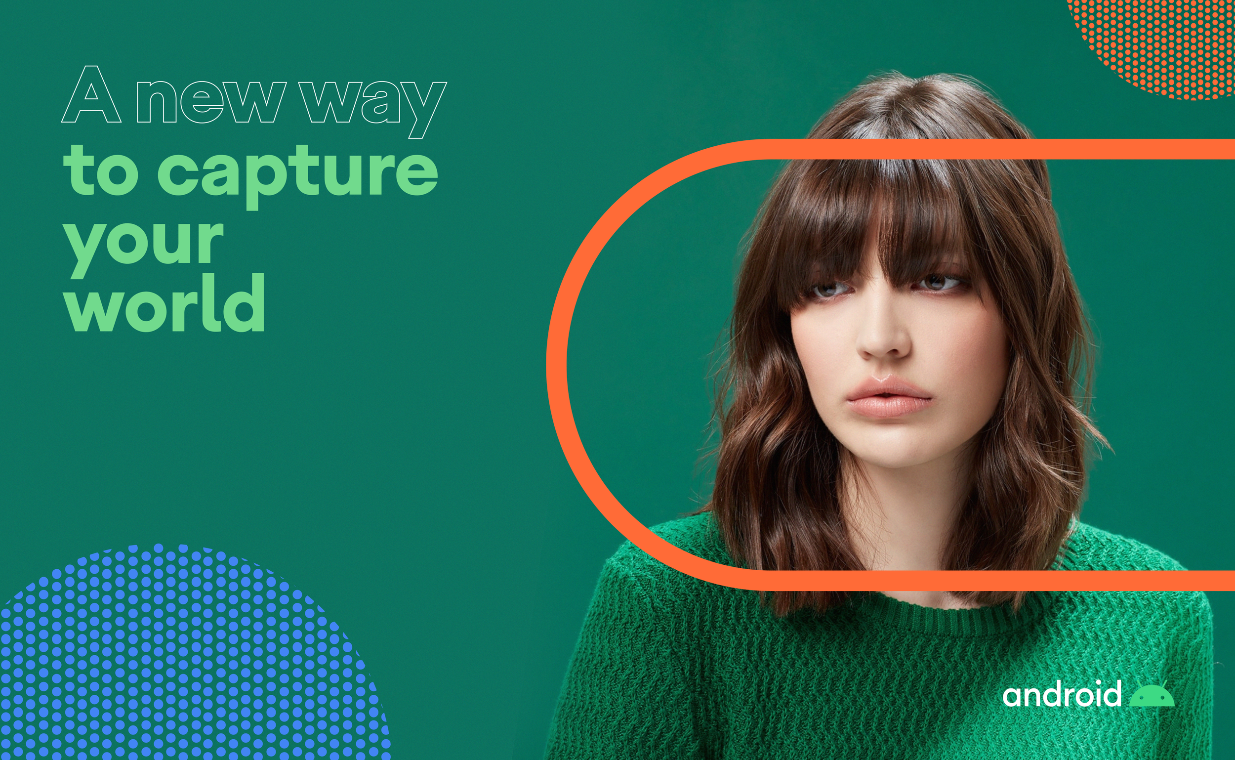
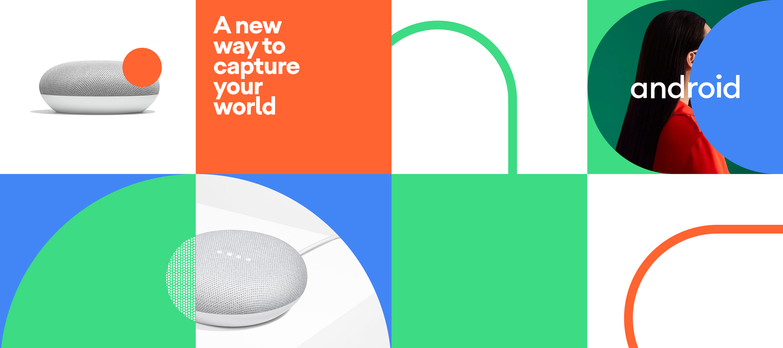
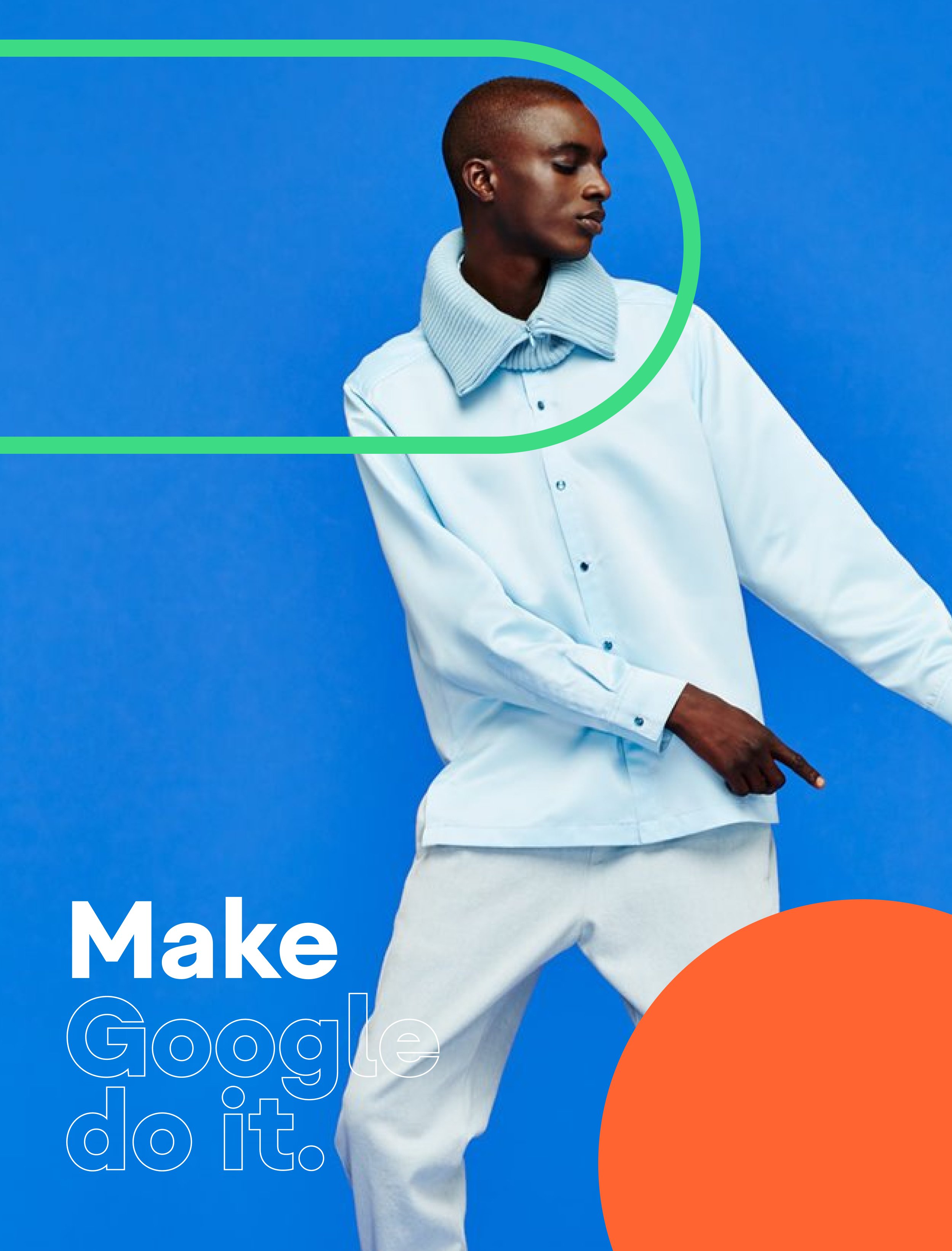
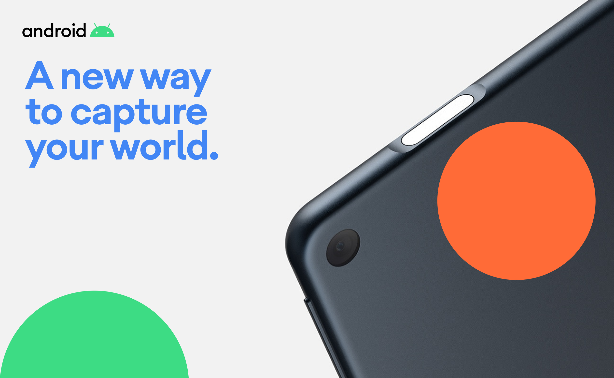
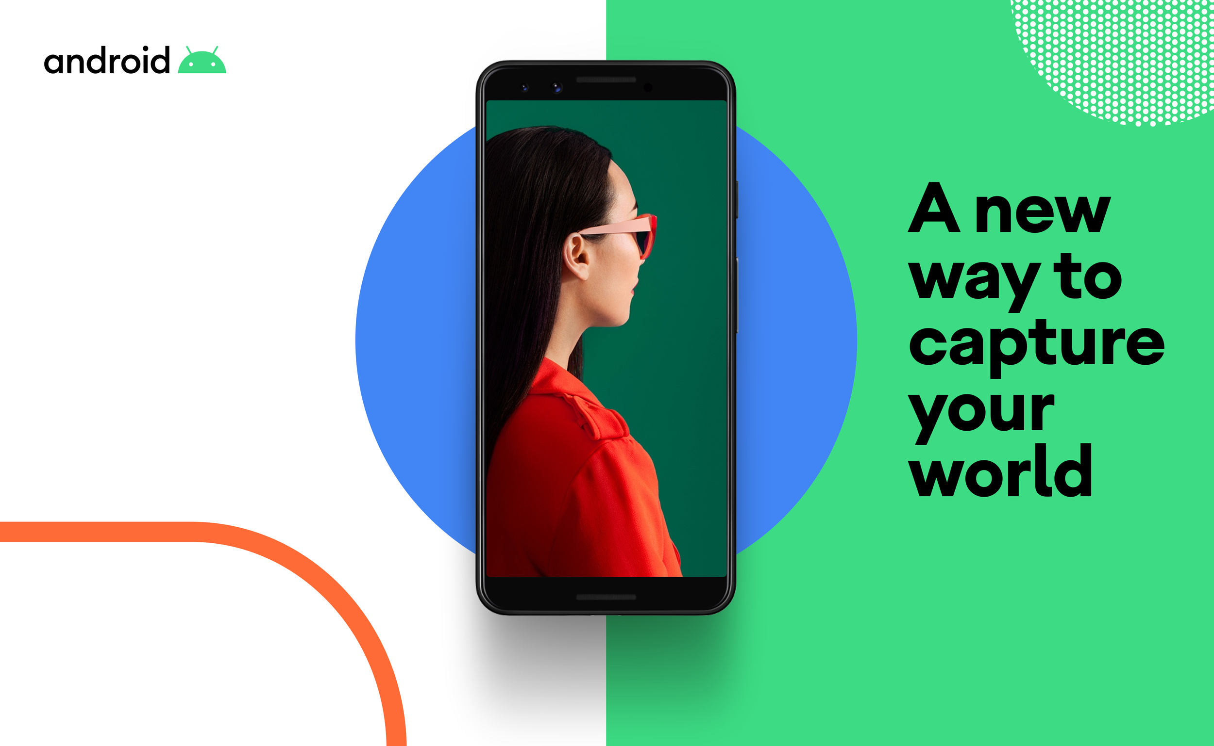
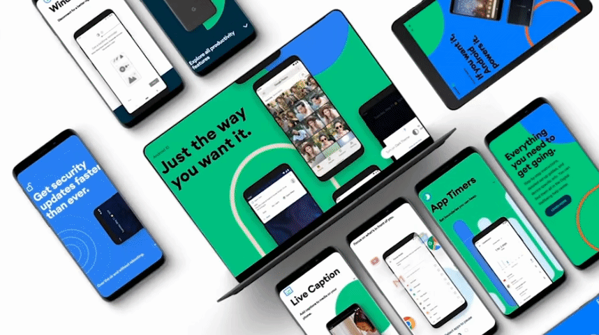
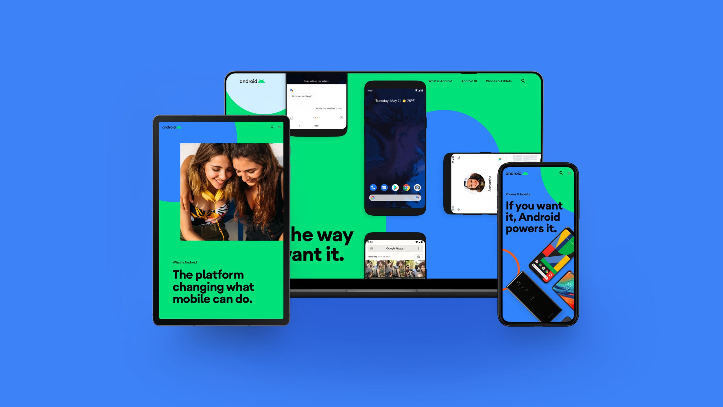
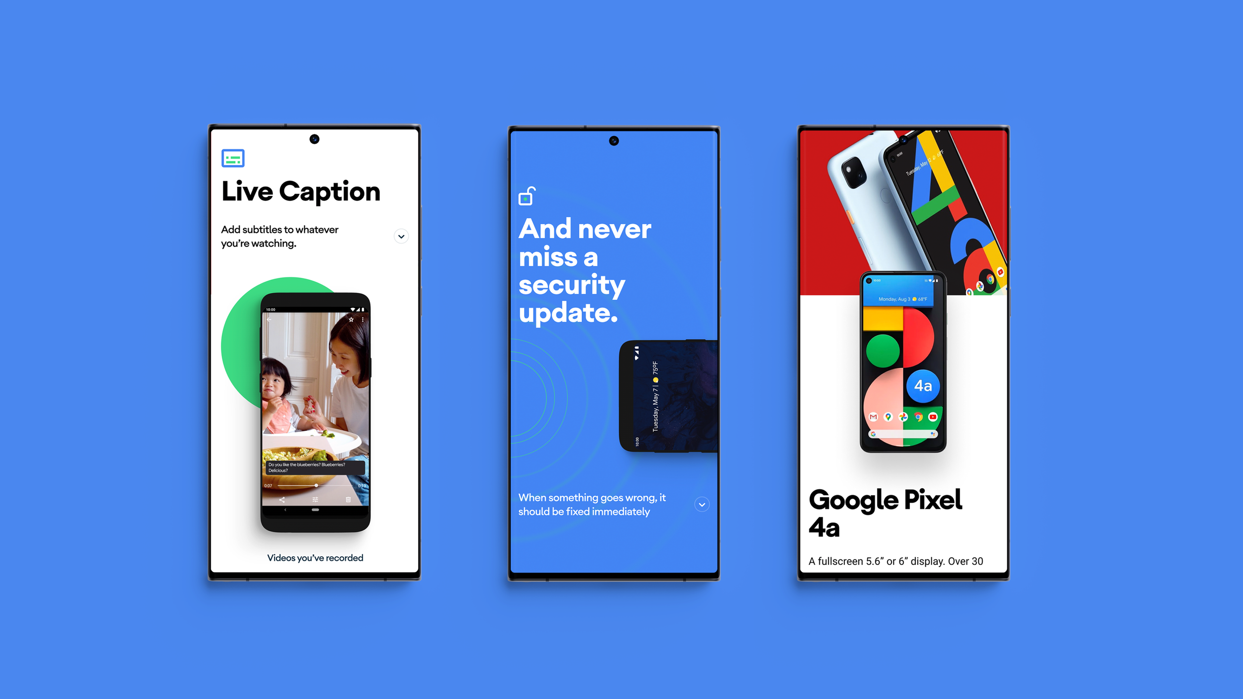
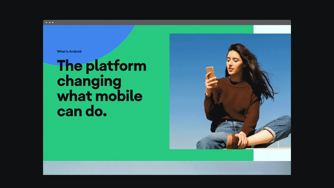
Android.com & Photography Art Direction
The new visual language through the new website also helps to convey how all of this plays out, which, in a nutshell, is big, bold, and colorful in execution and cheerful and empowering in feeling. The button-like shapes create surprisingly interesting compositions that provide a refreshing twist to the usual simplicity of most tech identities. Android is an optimistic brand. Whether indoors or outdoors, we utilize natural light to ensure scenes feel warm and inviting. Our selection and use of color shouldn't feel overly art-directed but should be considered, complementing our palette.
Early Visual Exploration
I conceived a visual concept inspired by the foundational principles of binary code and punch cards. Given Android's emblematic representation of the evolution of both developers and the engineering industry, I meticulously devised a binary alphabet by assimilating geometric shapes from the Android robot's shape. Additionally, I designed a typographic pattern reminiscent of punched cards, thus intertwining historical computing elements into a cohesive visual narrative.